
19 Simple Tips From 19 Different Landing Pages

A HubSpot study found that landing pages were key to collecting leads.
It’s simple: Businesses with more landing pages get more leads.
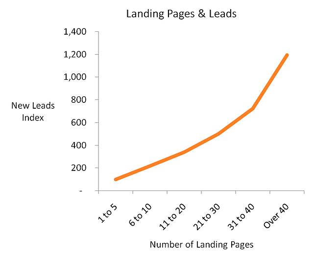
Obviously, it’s not just about blindly creating 25 new landing pages. These pages need to get traffic, and convert that traffic. The average landing page has a ~2% conversion rate.
The best landing pages can reach a 5–10% conversion rate.
Creating more landing pages is a good idea, but you also need to focus on improving your pages so your traffic converts into more leads.
You can apply some of these tips and double or triple the leads you’re getting.
In this article, I’m sharing 19 tips from 19 different landing pages. Some of these are brilliant examples of what you should aim for, and others make mistakes that you should avoid.
No one cares about “we”
There’s nothing wrong with talking about your business. You need to talk about your business and services on your landing page.
When you do talk about yourself, or “we”, it needs to be focused on the customer. People will pay attention when it’s about them.
This copy is all about “we”
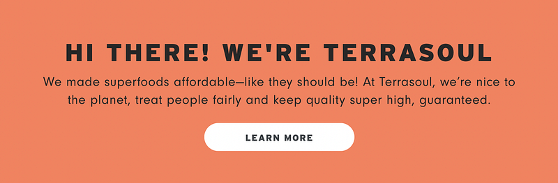
Here’s the same message, with more focus on the customer:
You deserve premium health without the premium price tag. Experience a world where quality is never compromised. With Terrasoul, top-notch wellness is within reach, guaranteed to uplift your health journey.
Use white space
People are awful at multitasking. We can only really focus on and understand one thing at a time.
If you’re reading this article and have the TV on in the background, you’ll only really hear one of them.
When I’m scrolling down your landing page, I should only see one point on my screen at a time.
I used to think that having white space was boring. The reality is, a lack of white space makes your page overwhelming and difficult to read.
Show your product in action
Whatever you’re offering to your visitor isn’t the actual thing you’re offering.
You’re selling them on the results.
Here’s a landing page for Perfect Draft — a countertop machine that pours cold beer.
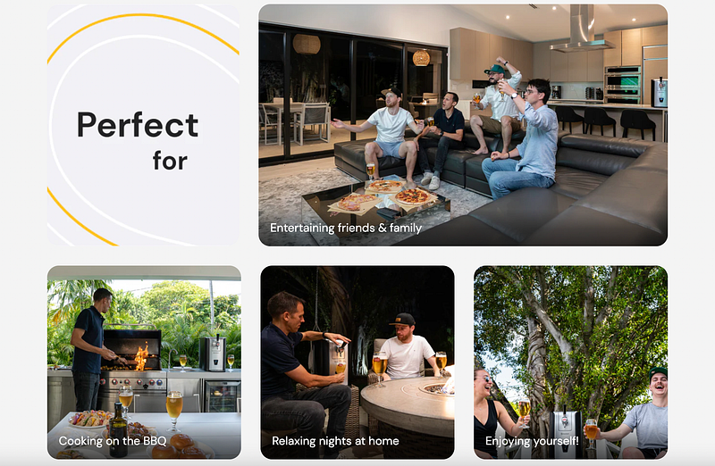
The Perfect Draft machine is in all of the images, but the focus is on the people, enjoying the results of the machine. They’re watching spots, barbecuing, relaxing outside, which is what they really desire.
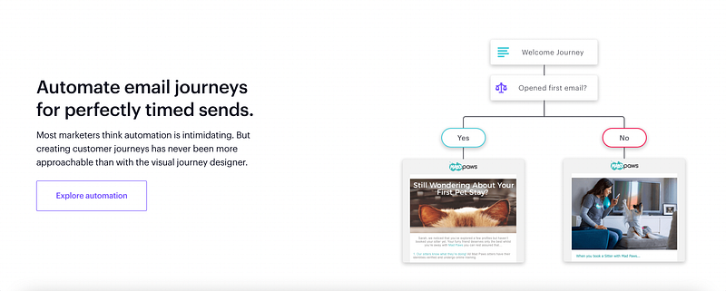
Address objections head-on
You need to find the top 3 reasons why people will decline your offer.
The biggest objection to email automation is that it’s complicated to set up.
This copy and image shows you that it’s simple and approachable. They even tell you that you probably think it’s intimidating — they understand your hesitations and created the easy solution.
Use a variety of social proof
Nearly every landing page I look at needs more social proof — evidence that people have used the thing you’re offering and had a good experience.
Every person will value a different type of social proof.
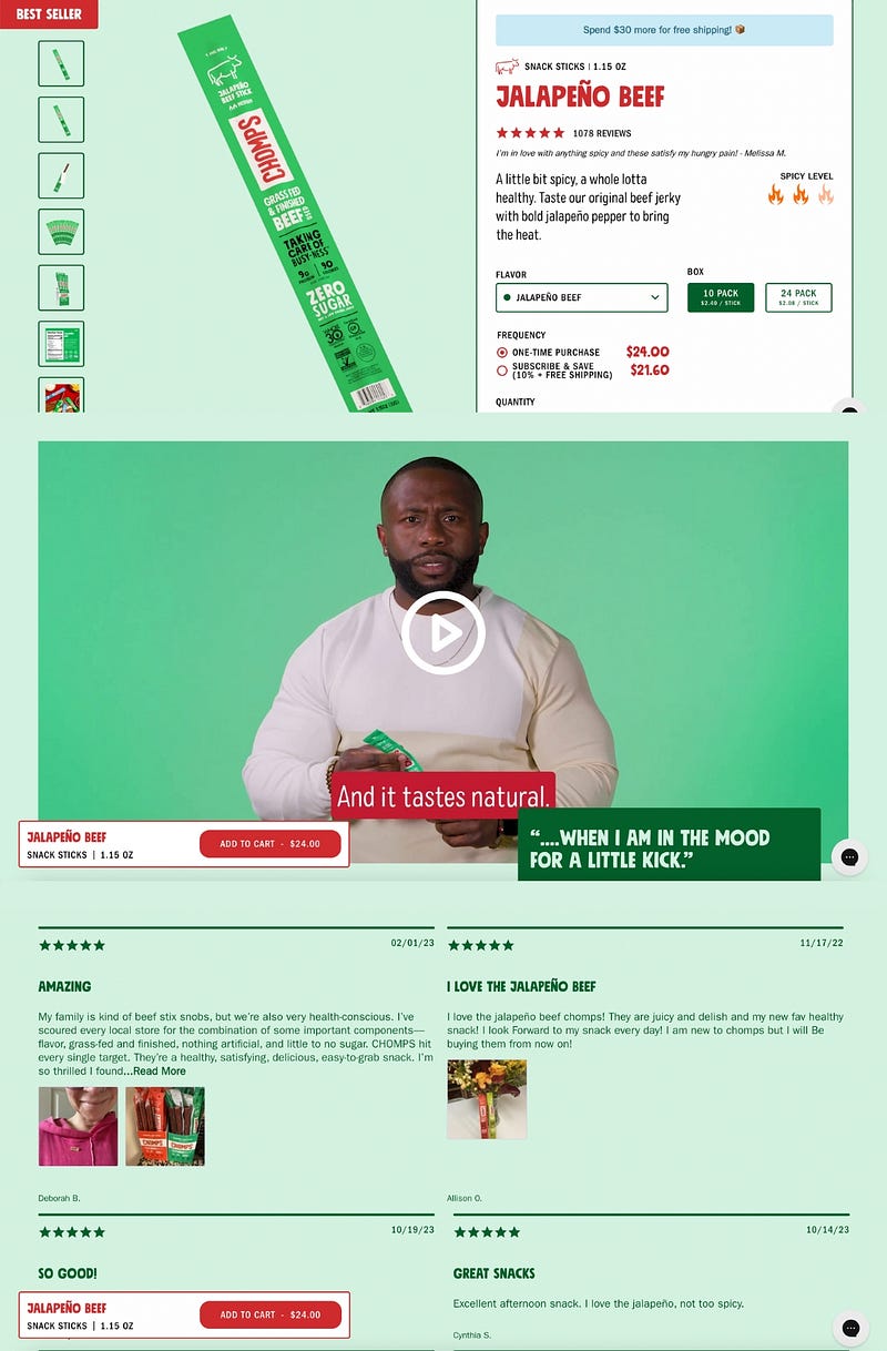
Some people will look at this page and see the 1,078 reviews. If 1,000+ people tried this and thought it was great, it’s probably decent.
Other people will want to watch a video, because they’re more genuine.
And other people will want to read reviews and see their specific questions answered.
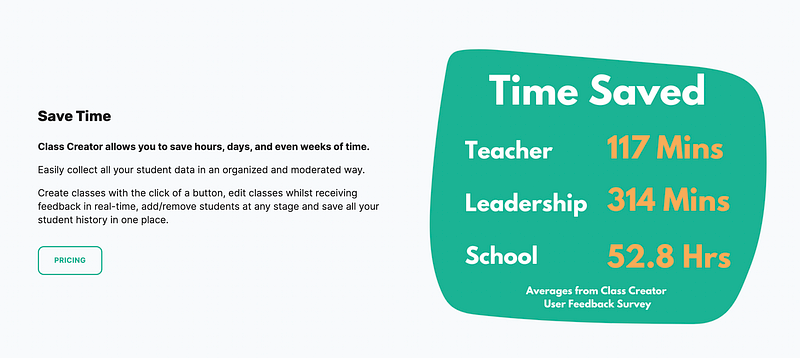
Make your benefits tangible
When you’re explaining the benefits of your product, you need to get people to feel them.
Saving time is a good benefit.
Teachers saving 117 minutes is a specific, tangible benefit.
Highlight your USP ASAP
One of the first things you need to highlight is what makes your solution uniquely valuable. That means you’ll highlight an added benefit you offer, or a common problem that your solution avoids.
MarketerHire is a platform that helps people hire marketers.
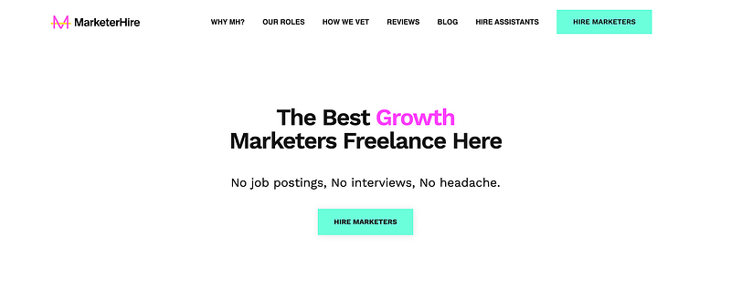
If you’ve ever hired someone, you know the big pain points:
- Overcrowded job boards
- Interviewing tons of people
- Hoping the person turns out to be legit
MarketerHire highlights their unique selling point right away: no job postings, interviews, or headaches.
Create an enemy
Creating an enemy is a powerful strategy — especially if your enemy is a product or brand that everyone recognizes.
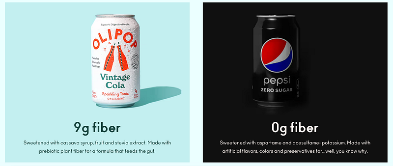
This side-by-side comparison makes zero-sugar Pepsi the enemy. It’s the enemy because it doesn’t have any fiber. This positions Olipop as the hero you need and simplifies the decision.
Pair features + benefits
Every copywriter will tell you to focus on the benefits.
It’s good advice, but it’s not the full story. You need to back up the benefits with features of your product.
Features = How does this work? Benefits = Why does this matter?
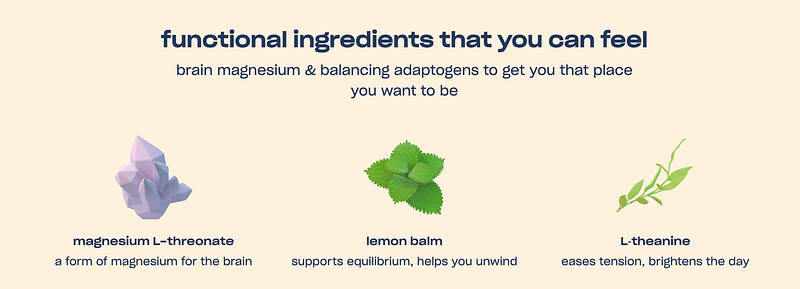
Feature: Magnesium L-threonate Benefit: Good for your brain
Feature: Lemon balm Benefit: Helps you unwind
Feature: L-theanine Benefit: Brightens your day
Be bold with your CTA button
The CTA button is the thing you want everyone to click on.
The easiest way to draw attention to your CTA button is to use a color that stands out from everything else.
Yours doesn’t need to be this level of contrast, but it shouldn’t be hard to find.
Tell your reader why you’re perfect for them
When people read your landing page, they should feel like your product or service has been handcrafted for them.
Show them where they currently are, why it’s bad, and their potential future after using your solution.
Do not, under any circumstances, have an immediate email pop up
I actually like this pop up offer. But I hated that it popped up 2 seconds after the site loaded. I was just getting to the headline before I was rudely interrupted.
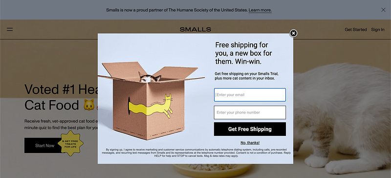
Everyone knows they can trade their email for a discount.
Let them learn a bit about what you’re selling before offering them free shipping or 10% off.
Eliminate distractions
Traditional landing pages have one primary goal.
The more buttons and links you have on your page, the more you increase the chances of people leaving without taking the desired action.
There’s only one button on Dan Koe’s landing page: Preorder Now.
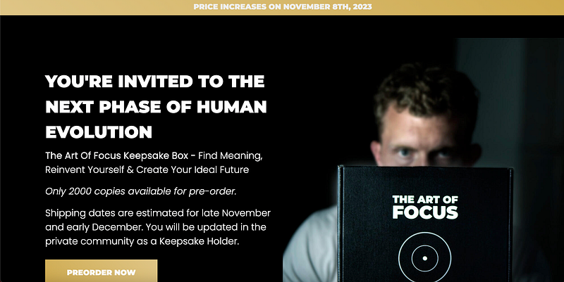
You can have a simple menu or secondary CTA button on your landing page. But you don’t want to flood your page with irrelevant links to your social media or blog posts.
Leverage serial position effect
The serial position effect is the combination of two cognitive biases: the primary effect and the recency effect.
This means more people remember the first and last parts of your copy. To leverage this, put the most important points or words at the start and end of your paragraphs.
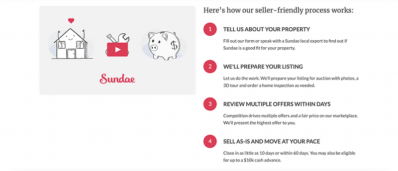
Make your process clear
You need to put yourself in a stranger’s shoes. They know nothing about your business. Even if they want what you’re selling, they’re unsure of how it all works.
I like to give people multiple options, like a 1–2 minute explainer video and simple text, like this:
Call out their problem
I laughed when I saw this CTA heading:
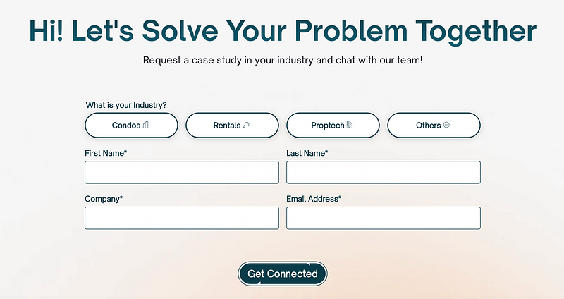
“Let’s solve your problem together” sounds like placeholder text that’s waiting to be replaced with the actual CTA.
Be as specific as possible when telling people what problem you’re going to help them solve. In this specific case, it should say, “Stop wasting your marketing budget.”
Handpick the testimonials you share
If you’re going to share reviews (which I highly recommend) you need to be sharing the very best reviews you get.
Here’s an example of what not to do:
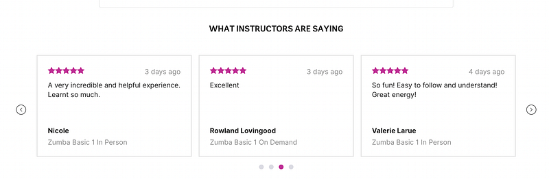
The reviews should highlight the features, benefits, and transformational powers of your product. “Excellent” doesn’t do any of that, and it’s a big missed opportunity.
Use side-by-side comparisons
Most people who want what you’re selling will compare your solution to your competitors or their current solution.
The best place for them to do the comparison is on your landing page — where you have full control over what they see.
Compare your solution with the most popular competitors and highlight the specific features or benefits that make you the better solution.
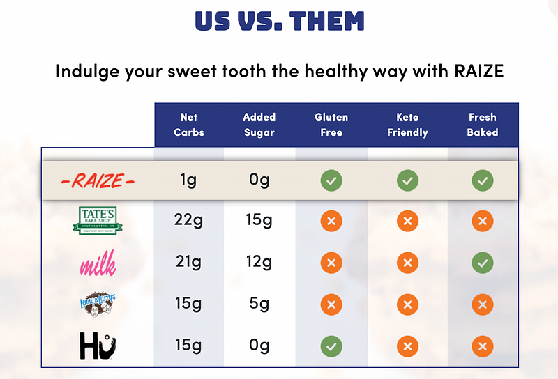
Raize compares their keto cookies to Hu chocolate.
Hu compares their chocolate to traditional chocolate on their product page.
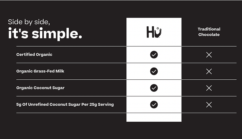
Both of them use side-by-side comparisons to make their product look like the obvious best choice.
Now you need to go apply these tips to your landing pages!
If you enjoyed this article, save my list of landing page articles for future reference. It’s a goldmine of information that I’ve spent 100s of hours creating.
PS. I just launched Landing Page Blueprint to help you learn and implement the keys to creating high-converting landing pages for your business and clients. It includes the essentials from my course, for 1/10th the cost.
Find out more here:


