
14 ways that good design builds trust with users
What it is, why it matters, how to do it

I was recently asked for a view on ‘what builds or erodes trust’ in Experience Design. I’m going to break it down, but overall my response can be summed up as:
Design things properly and don’t be evil
What is trust?
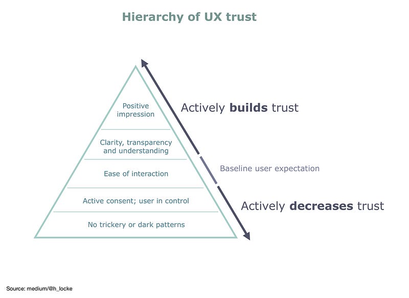
I define trust in a UX context as follows: —
Trust is a user’s experience of your product or service, that leads them to believe that:
- Your product/service/interface/experience can solve their current need
- It will be as simple and easy as possible to use
- They will not inadvertently do something they did not intend
- They will not be deliberately tricked into doing something they did not intend
- They will understand everything that happens through the journey and any outcomes
- They will clearly consent to any data or financial transaction that occurs
- They will experience some level of positive overall impression of having engaged with your brand, product or experience, such that they may wish to do so again.
And because I am a geek, I have created the following framework, shamelessly hijacking Maslow because the guy understood humanity.
Why does it matter?
This sounds like a no-brainer however..
If you do not design for trust, your users will not trust you, your experience, your product, potentially even your brand, and may well trot off to competitors who know how to design things properly, and not be evil.
Interestingly, this is why startups are so well positioned to grab market share in the digital space — old school trusted brands are so drowned in legacy systems and politics that many of the digital experiences they manifest will break a number of the guidelines proposed below.
Whereas a startup, with no legacy systems and a commitment to good UX design and user-centred methodologies can nail it from their MVP onwards.
How do you design trust into experiences?
As always, my first caveat is “It depends”. Because of course different user groups need different things from different experiences.. from different brands. Which is of course why you are doing primary research before you start designing things. Ahem.
However.
There are practices and standards that are central to good UX design, that for the vast majority of experiences will increase trust if you do them, and decrease trust if you don’t.
And this applies whether you are a household name or a startup brand. As above, you can be a major household brand and still destroy your online or digital credibility by not designing things properly, or by being evil.

14 Things that impact users’ trust in your digital product
1. Basic usability
Your experience should follow UX best practice in terms of usability. It should follow design heuristics. This is not enough, but it is a start.
On top of this, you should be testing with users; real users. Not your wife or your neighbour. It is evident to the user if your product has been tested and those findings actually implemented (rather than merely giving lip service to the process), because in a live environment with real end-users, it will be usable. And therefore Twitter will not be full of real users pointing out that your product is unusable. Simples.
2. Visual design
Even if you have the most usable product in the world, products should still demonstrate care and attention to aesthetics. Users are influenced by look-and-feel. Unless you are Amazon, you can’t get away with usable-but-ugly. If the first bite is with the eye, and your experience is ugly, you will have to work a lot harder to keep them engaged. In short, it has to be usable and desirable.
3. Accessibility
Often the casualty of #2 above. Make it pretty, and make it accessible. I don’t need to write another post about colour contrast or moral imperatives — just do it. Why should anyone trust a brand who actively excludes user groups?
Again…
Design things properly and don’t be evil

4. Use recognised design patterns
Design patterns exist across every platform and every business type. And they exist for a reason — because they are familiar to users. If users find experiences familiar at a level of basic appearance and interaction, they will be able to use it without instruction, feel more confident and safe, be in control of their own experience and actions and therefore.. trust.
Also, the human brain is lazy. Why should a user have to try and learn your innovative, magical, made up way of adding a product to a basket? They’ll just go somewhere else and buy their stuff instead because they feel safe.
“Yeah but Apple changed everything and made up new things”
Why, yes they did. But they also invented an entirely new platform, with its own (consistent) design and interaction patterns, and they made the pattern library publicly available so that other designers would contribute experiences that were also consistent. And they regulated this via the App Store.
And of course they tested their products and platforms with users. Let’s not pretend they are psychic. We all know which UX agencies have top secret locked rooms where they do white-label user-centred design research for Apple.

5. Dark patterns. Don’t use them.
Dark patterns are design patterns that deliberately manipulate the user into doing things they wouldn’t consciously or otherwise want to do. There are lots of them. Here’s the main resource on this topic. Fight against these things, they are evil.
6. Behavioural nudges. Be careful
Along with UI-based dark patterns, there are also tricks based on behavioural nudges. Here we need to consider whether you are using them for good or for evil.
Behavioural nudges are common in UK government communications (and elsewhere). It makes sense — anything that stops people smoking, or starts them exercising (or wearing masks!) is a good thing, right? In the UK, the government even set up the “nudge unit” which brought this practice to public attention.
But that also means that b2c brands are using these methods as dark patterns. And this is where legal attention is now starting to focus, much as it did with GDPR.
Nevertheless, if you are going ahead with nudges, there are things you can do to align to the side of good rather than evil.
Here’s an example: if you’re using “social proof”, to try and increase trust-based conversions, such as having positive reviews on your site next to your “buy” or “download” button, you need to ensure that they reflect the reality of your product. What you should avoid is having tons of glowing reviews on your website or in your marketing if your App Store or Trust Pilot reviews are shockingly bad. Apart from being nudges-for-evil, users can easily see the lies by Googling external product reviews for themselves.
That is not going to help your trust or your sign up levels.

7. Language, words, copy
UX writing is a specialist skill set for a reason — words are important. However, most teams can make product copy more trustworthy by clarity and transparency of communication.
For example, ensuring that copy is clear and transparent, using simple verbs on a CTA that reflect the consequent action, removing anything that sounds like marketing spin or could be misconstrued. And of course, testing products with real users, prior to launch allows you to assess clarity and comprehension first-hand.
This is not to say that you shouldn’t include brand personality in your interactions, but consider the user’s mindset — are they about to hit submit on a £10,000 purchase? Then probably not the best time to distract them with overly flowery words that might cause confusion. In fact any interaction where there may be an increased level of user stress should be an automatic trigger for delivering the simplest, clearest, most transparent messaging.

8. Attention to detail
This one is a combination of copy, design and build — the product overall must look like someone cared enough to proofread it, to browser test it, to ensure that the experience renders correctly on a range of devices, to ensure that there are no dead links.
And if you’re planning on handing over to CMS users, the thing should be built in such a way that other people cannot inadvertently do things that then makes the site less usable, less accessible, less readable — less trustworthy.
9. Connected journeys
This one should be an entire post of its own — journeys should make sense. Buttons should have clear, transparent, honest CTAs that take the user to a destination they can easily anticipate. As a user, clicking through to an unexpected destination reduces trust and can increase bounce and exit rates. Constantly interfering with the user journey via pop-ups, or misdirecting users to sales pages will have a similar effect.
If you need a mental model for this — dodgy Facebook ads. That.

10. Sensible information architecture
We know that solid IA work plays many roles in a team’s ability to deliver a good user experience. And it also has a role in establishing trust.
Does the product’s navigation make sense to users? Does it fit their mental models? (again, the role of research) Is it logical? Does the user know where they are in the journey at all times? Can they find the right content in the right place at the right time or are they overwhelmed with everything at once?
Dead ends, poorly labeled content, these often lead to an incoherent product and incoherent user experience.
Also, trust plays a role here when product meets marketing. Who owns the overall customer journey from marketing journey to product IA? If it’s two different siloed design teams, you’re going to end up with two different experiences bolted together. It’s not going to feel consistent and transparent — it’s not going to feel trustworthy.

11. Performance
If your product takes a long time to load content (sometimes even with techniques like lazy loading), or fails to respond quickly to user interactions, this signals to the user that this site is not well-built. If it’s not well-built it may not be secure — if it’s not secure, it can’t be trusted.
12. The use and misuse of user data
Connected to the use of dark patterns mentioned above, if the user feels that the experience has captured or misused data — for example being followed round the internet with banners or sending creepy over-personalised or irrelevant emails — you will erode trust in your product or brand, and potentially limit the likelihood of users handing over data in future.
So in designing user experiences, a-là GDPR — we need to be considering how we ask for data, how we use data, how we communicate that usage and what level of transparency and control over data are we giving back to our users.

13. Appropriate value exchange
Most experiences ask the user to do something — sign up, log in, provide data, share something. The experience must ask the user to commit to actions that are balanced with an appropriate reward.
For example, asking users to provide their name, dob, address, and childrens’ names — in order to sign up to a newsletter — is an inappropriate and unbalanced value exchange. Users may ask “why do you want this data?”. And increasing user hesitancy to engage with your product builds distrust.
14. Maintenance
As touched on above, sometimes what happens to your product post go-live can have as much impact on user trust over time as your shiny launch.
So don’t do everything above, press “live” and walk away. Especially if you’re handing over the keys to a CMS. You are delivering a service whether it’s a website or an app or an IPTV subscription; assuming you expect your users to engage with it more than once.
Any post-live planning should include: What design system or pattern library are we going to draw on for future updates? What research program is going to evaluate product performance over time, or identify changes in user expectations? How are we going to stay on top of evolving accessibility guidelines (yes I’m looking at you, WCAG) How are going to ensure the IA and any incoming/outgoing journeys are future-proofed as the product grows? What are our longer term security and data plans?
Pushing something live and walking away without a plan in place can change a high-trust product into a broken down, out-of-date, unusable and inaccessible experience. Which is going to have a massive impact on your brand and product trust.

It’s.. obvious?
When I was first asked about trust in Experience Design — my first response was that it’s simple — it’s obvious — it’s what we strive to do every day as UX practitioners. But it’s clear that as with so many things that are worthwhile in life, hard things are hard.
Trust also involves more than just UX design and research — it involves clients, stakeholders and brands who will approve clear and transparent copy; it involves dev teams, data people, systems and infrastructure that can support a robust experience; it means everyone involved in the product from inception through design and build to managing and maintaining a live product to follow and believe in the same thing:
Design things properly and don’t be evil
If you found this useful, consider subscribing for free to get email alerts when I post new articles, or you can join Medium for full access to my article archive, plus everything else on Medium.


