
10 Ways to Improve Dropdowns in UI & UX Design
If appropriately used, dropdowns don’t have to be awful.
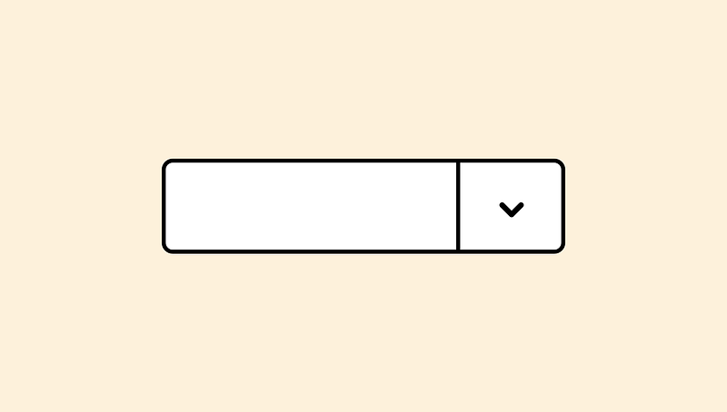
Dropdowns are one of the most widely used and versatile tools in the UI & UX designer’s toolbox.
They provide a simple way for designers to group many options into one handy component.
There are though some fundamental ways in which dropdowns should be improved.
If you follow these tips, you’ll be sure to improve your user’s experience while leveraging the flexibility and simplicity of dropdowns.
This list was adapted from a 2016 Keynote at SXSW by Golden Krishna of Google, the author of “The Best Interface is No Interface,” and Eric Campbell of Rdio — You Know What? Fuck Dropdowns.
1. Smart Default
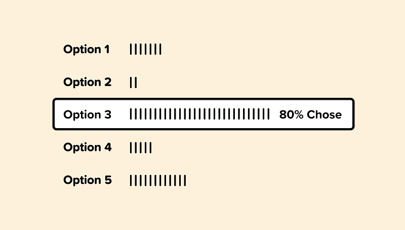
By utilizing analytics and overall usage patterns, we can determine which option is selected most frequently from our dropdown.
If 80% of the users are selecting a specific option, then we can allow 80% of users to skip this step entirely by making that option the smart default.
If you’re paying a speeding ticket on a Colorado website, for example, it would make sense for the smart default to pre-select Colorado as the state.
2. Simplify
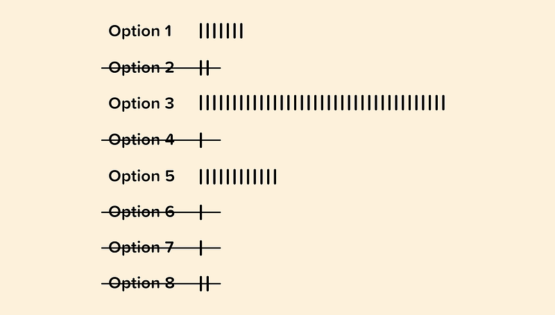
When possible, we can use analytics to inform on which options from our dropdown may be unnecessary.
If users are only selecting a handful of options and rarely selecting or never selecting others, then we can consider removing them.
Having a concise dropdown will make it easier for our visitors to quickly choose the option that is most relevant to them.
3. Individual Usage Patterns
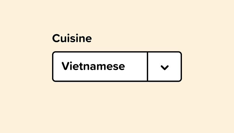
Similar to smart defaults, we can pre-select an option that is specific to an individual user.
For example, if our logged in user frequently orders Vietnamese food, we can pre-select that cuisine for them and show them relevant options to that selection.
The smarter our inputs can be, the better the experience for our users.
This could also work for airlines or travel software. Once a booking website knows where you frequently fly from and fly to, those options could be set as your default.
4. Regional Smart Default
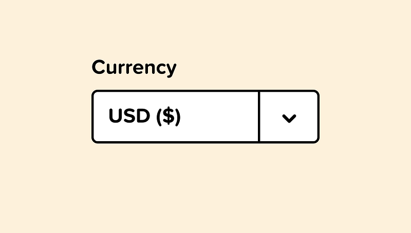
Regional usage patterns pre-select an option that is relevant to a particular geographical location.
For example, if we are asking for currency or if they’re looking for store locations near them, requesting location permission allows us to guess the most appropriate selection.
This is always an improved experience from “Select your location.”
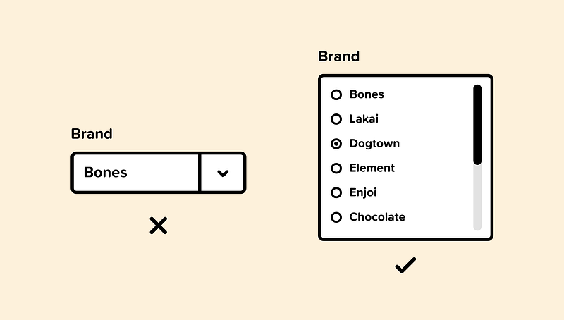
5. Use Radio Buttons
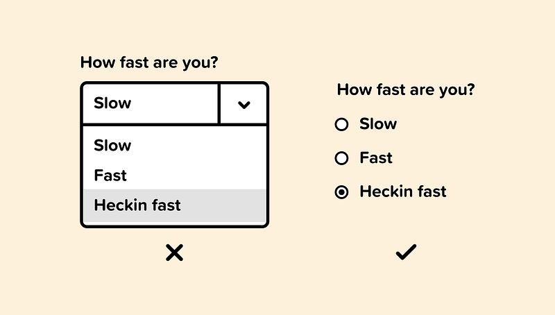
If there are only a handful of options, then consider using radio buttons instead.
Radio buttons present all of the options to the user at a glance and require fewer clicks to get to the option they need.
It’s generally a good rule of thumb to use radio buttons instead of a dropdown if you have six or fewer options.
6. Use a Slider
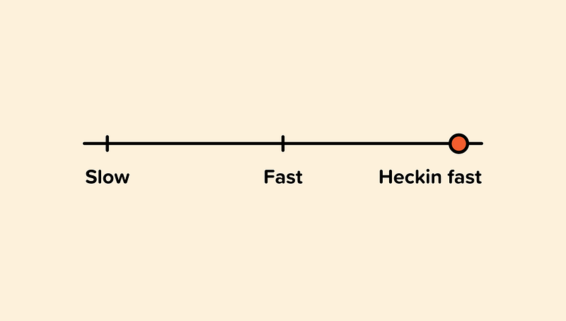
A slider is a great way to represent options that are ordered from least to greatest in a linear fashion.
A slider makes it easy to see the minimum and maximum values visually.
If the content in your dropdown in quantitative and you have only a handful of options, then a slider could be the right component to use.
Selecting your shipping method is a good example of this. Showing the standard — priority — overnight options in a slider visually represents the fastest and slowest option.
7. Use Visual Elements
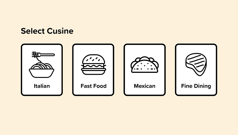
Occasionally the options in a dropdown are visual elements. Instead of placing them in a dropdown, we should design our interface to represent them as what they are.
We see this frequently with color options on an e-commerce site. Displaying the possible color options is an improved experience over a dropdown.
8. Add Type Ahead
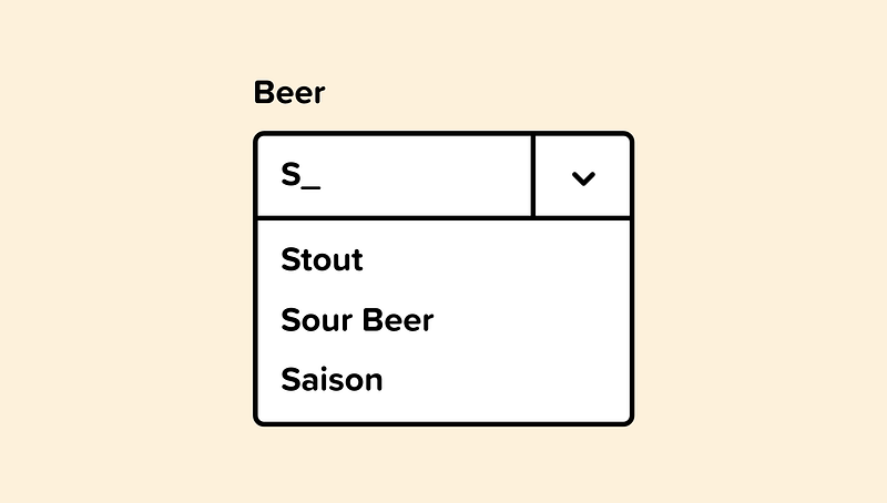
Type-ahead is useful for long lists because it doesn’t require the user to scroll through all the options to find the one they need.
When there’s an inescapable array of options that must be presented, we should add the ability to filter our dropdown using type ahead.
If there’s a “Select your state” dropdown, type-ahead will allow me to skip over all the states and quickly get to Colorado.
9. Make Inputs Smarter
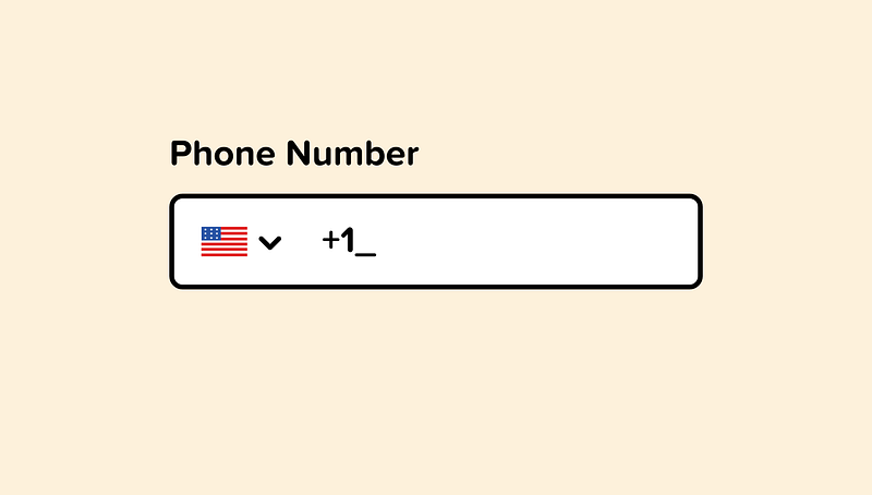
If our programs can understand and accept natural language, then we can allow most users to skip the dropdown all together.
Instead of having a dropdown for every currency, or country code, we can simplify by just letting the user input their information and build our programs to recognize it.
Designing our software so that user input informs the type of input is a much smarter interface than one that requires the user to tediously define every input type.
10. Use Listboxes
Dropdowns require clicking into them to see the options. Listboxes, in contrast, allows the user to see the possibilities without them hiding inside a dropdown.
Listboxes can include checkboxes, radio buttons, or toggle switches.
Listboxes are frequently used on e-commerce websites when displaying categories, size, price range, color, and so on.

👋 Let’s be friends! Follow me on Twitter and Dribbble and connect with me on LinkedIn. Don’t forget to follow me here on Medium as well for more design-related content.


