
10 Modern CSS Layouts With One Line
Original:https://1linelayouts.glitch.me/

Modern CSS layout allows developers to write meaningful and powerful style rules with just a few keystrokes. The above discussion and the following post examine 10 powerful CSS layouts that do some extraordinary work.
01. Super center: place-items: center
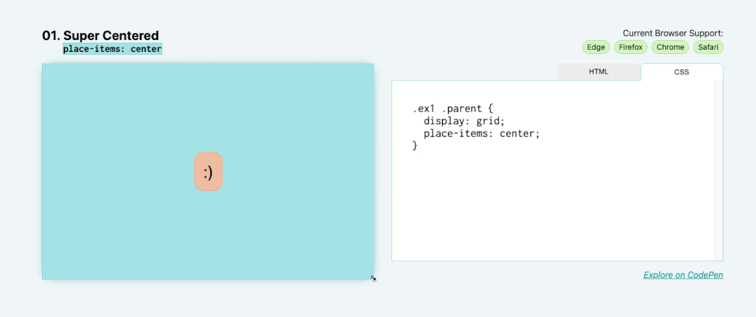
For our first “single row” layout, let’s solve the biggest mystery in all of CSS: centering. I want you to know that using place-items: center makes this easier than you think.
First specify grid as the display method, then write place-items: center on the same element. place-items is a quick way to set align-items and justify-items at the same time. By setting it to center, both align-items and justify-items will be set to center.
.parent {
  display: grid;
  place-items: center;
}
This allows content to be perfectly centered within the parent, regardless of internal size.
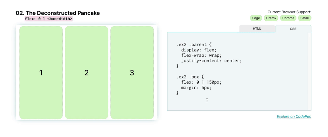
02. Deconstructing the pancake layout: flex: <grow> <shrink> <baseWidth>
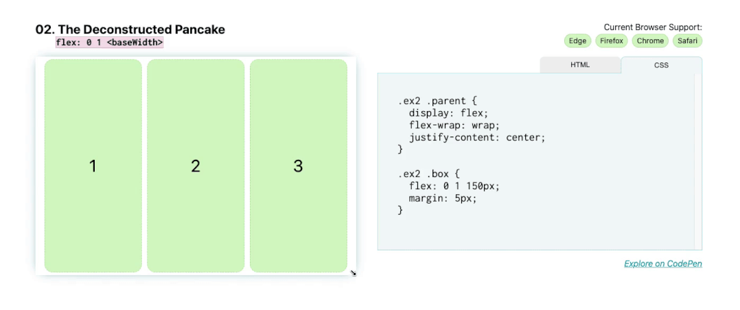
Next we have deconstructed pancakes! This is a common layout for marketing websites, for example there might be a row of 3 items, usually with an image, a title, and then some text describing some of the features of the product. On mobile, we want them to stack nicely and scale as we increase screen size.
By using Flexbox to achieve this effect, you don’t need to use media queries to adjust the position of these elements when the screen size changes.
The abbreviation for flex stands for: flex: <flex-grow> <flex-shrink> <flex-basis> .
Because of this, if you want your boxes to fill to their <flex-basis> size, shrink to a smaller size, but not stretch to fill any additional space, write: flex: 0 1 <flex-basis> . In this case yours <flex-basis> is 150px, so it should look like this:
.parent {
  display: flex;
}

.child {
  flex: 0 1 150px;
}
If you really want the box to stretch and fill the space when wrapping to the next line, <flex-grow> set it to 1, so it should look like this:
.parent {
  display: flex;
}

.child {
  flex: 1 1 150px;
}
Now, when you increase or decrease the screen size, these flex items shrink and grow.
03. Sidebar layout: grid-template-columns: minmax( <min>, <max>) …)
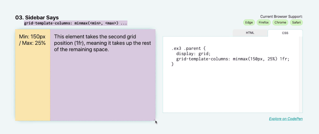
This demonstration utilizes the minmax function for grid layout. What we do here is set the minimum sidebar size to 150px, but on larger screens, let it stretch out by 25%. The sidebar will always occupy 25% of its parent’s horizontal space until 25% becomes less than 150px.
Add the following value as the value of grid-template-columns: minmax(150px, 25%) 1fr . The items in the first column (in this case, the sidebar) have a minmax of 150px (at 25%), and the items in the second column (here the main section) occupy the remaining space as a single 1fr track.
.parent {
  display: grid;
  grid-template-columns: minmax(150px, 25%) 1fr;
}
04. Pancake stack layout: grid-template-rows: auto 1fr auto
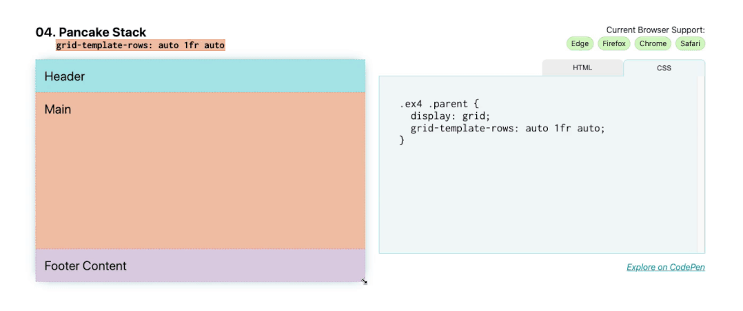
Unlike Deconstructed Pancake, this example does not include its child elements when the screen size changes. Often called a sticky footer, this layout is commonly used on websites and apps, across multiple mobile apps (the footer is often a toolbar) and websites (single-page apps often use this global layout).
Adding display: grid to the component will give you a single column grid, but the main area will only be as tall as the content below the footer.
To make the footer stick to the bottom, add:
.parent {
  display: grid;
  grid-template-rows: auto 1fr auto;
}
1fr header and footer content are set to automatically take the size of their children and apply the remaining space (1fr) to the main area, while auto-resized rows will take the size of their children’s smallest content so that content size increases , the row itself will grow to adjust.
05. Classic Holy Grail layout: grid-template: auto 1fr auto / auto 1fr auto
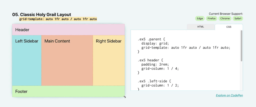
For the classic holy grail layout, there’s a header, footer, left sidebar, right sidebar, and main content. Similar to the previous layout, but now with sidebar!
To write an entire grid in one line of code, use the grid-template property. This allows you to set rows and columns simultaneously.
The attribute and value pairs are: grid-template: auto 1fr auto / auto 1fr auto . The slash between the first and second space-separated lists is the separator between rows and columns.
.parent {
  display: grid;
  grid-template: auto 1fr auto / auto 1fr auto;
}
Like the previous example, the header and footer have auto-sizing content, here the left and right sidebars auto-size based on the intrinsic size of their children. However, this time the dimensions are horizontal (width) instead of vertical (height).
06. 12-Span Grid: grid-template-columns: repeat(12, 1fr)
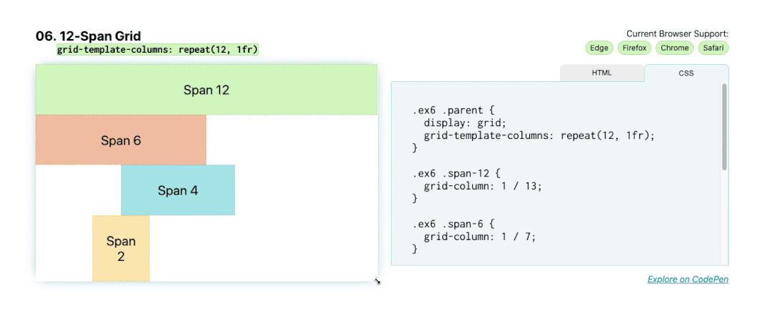
Next we have another classic layout: 12 across grid. You can quickly write grids in CSS using the repeat() function. Using repeat(12, 1fr); on the grid template columns will give you 12 columns for each 1fr.
.parent {
  display: grid;
  grid-template-columns: repeat(12, 1fr);
}

.child-span-12 {
  grid-column: 1 / 13;
}
Now that you have a 12-column track grid, we can place children on the grid. One way is to use grid lines to place them. For example, grid-column: 1 / 13 will span from the first to the last row (row 13) and span 12 columns. grid-column: 1 / 5; will span the first four columns.
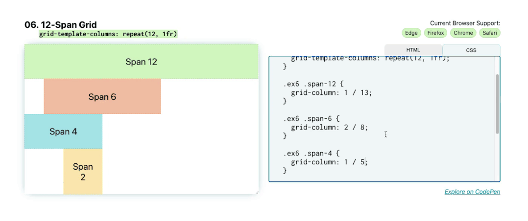
Another method is to use the span keyword. Using span, you set a starting line and then the number of columns spanned from that starting point. In this case, grid-column: 1 / span 12 will be equivalent to grid-column: 1 / 13 , and grid-column: 2 / span 6 will be equivalent to grid-column: 2 / 8 .
.child-span-12 {
  grid-column: 1 / span 12;
}
07. RAM (Repeat, Auto, MinMax): grid-template-columns(auto-fit, minmax( <base>, 1fr))

For this seventh example, combine some of the concepts you already know to create a responsive layout with automatically placed and flexible children. Nice and neat. The key points to remember here are repeat , auto-(fit|fill) and minmax()’ , remember their acronym RAM.
In short, it should be like this:
.parent {
  display: grid;
  grid-template-columns: repeat(auto-fit, minmax(150px, 1fr));
}
You use repeat again, but this time using the auto-fit keyword instead of an explicit numeric value. This automatically places these child elements. The basic minimum size of these child elements is 150px and the maximum size is 1fr, which means that on smaller screens they will take up the entire 1fr width, and when they reach 150px width they will start to flow onto the same line.
Using auto-fit, when their horizontal size exceeds 150px, the boxes will stretch to fill the entire remaining space. However, if you change it to auto-fill, they will not stretch when exceeding the base size in the minmax function:
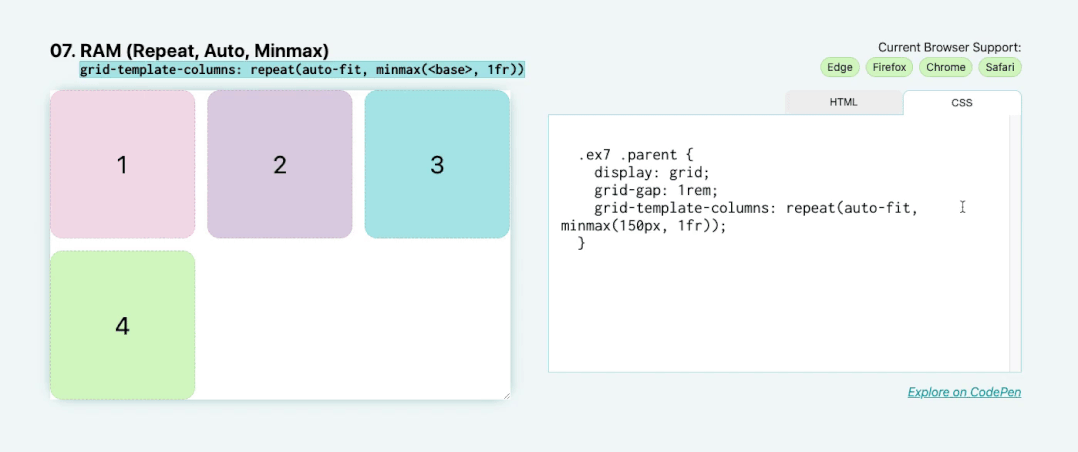
.parent {
  display: grid;
  grid-template-columns: repeat(auto-fill, minmax(150px, 1fr));
}
08. Arrangement and layout: justify-content: space-between
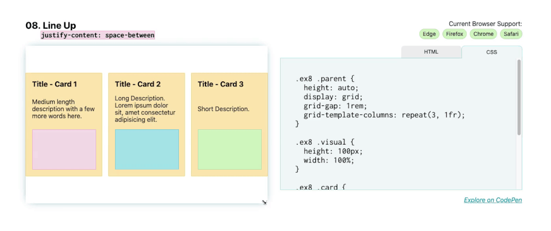
For the next layout, the main thing to note here is justify-content: space-between , which places the first and last child elements at the edge of their bounding box, with the remaining space evenly distributed between the elements. For these cards, they are placed in Flexbox display mode, using flex-direction: column to set the direction to column.
This will place the title, description, and image blocks in vertical columns within the parent card. Then, apply justify-content: space-between to anchor the first (title) and last (image block) elements to the edge of the flexbox, with descriptive text between them placed with equal spacing to each endpoint.
.parent {
  display: flex;
  flex-direction: column;
  justify-content: space-between;
}
09. Keep my style: clamp( <min>, <actual>, <max>)
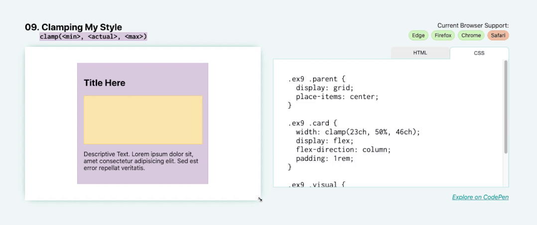
Here, we introduce some technologies that are only supported by a few browsers, but have very exciting effects on layout and responsive UI design. In this demonstration, you will use the clamp tool to set the width, as shown below: width: clamp( <min>, <actual>, <max>) .
This will set the absolute minimum and maximum size as well as the actual size. With the values, it should look like this:
.parent {
  width: clamp(23ch, 60%, 46ch);
}
The minimum size here is 23ch or 23 character units, and the maximum size is 46ch or 46 characters. Character width units are based on the element’s font size (specifically the width of the 0 glyph). The “actual” size is 50%, which represents 50% of the width of this element’s parent.
Here, what the clamp() function does is keep the element 50% wide until 50% is greater than 46ch (on a wider viewport) or less than 23ch (on a smaller viewport). You can see that as I stretch and shrink the parent dimension, the width of this card increases to its maximum limit point and decreases to its minimum limit point. Then it stays centered on the parent because we’ve applied other properties to center it. This allows for a cleaner layout, as the text is not too wide (more than 46ch) or too narrow (less than 23ch).
This is also a great way to implement responsive typography. For example, you can write: font-size: clamp(1.5rem, 20vw, 3rem) . In this case, the title’s font size will always remain between 1.5rem and 3rem, but will grow and shrink based on the actual 20vw value to fit the width of the viewport.
This is a good technique to ensure legibility with minimum and maximum size values, but keep in mind that not all modern browsers support it, so make sure you have fallbacks in place and test.
10. Maintain aspect ratio: aspect-ratio: <width> / <height>
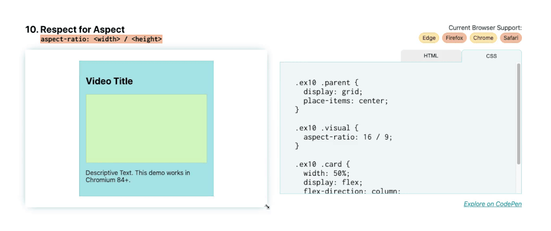
This last layout tool is the most experimental. It was recently introduced into Chrome Canary in Chromium 84, and Firefox is actively working on making it happen, but there aren’t any stable versions of the browser yet.
I did want to mention this, though, because it’s a question that comes up quite often. This simply maintains the aspect ratio of the image.
Using the aspect-ratio property, when I resize the card, the green visual block maintains the 16 x 9 aspect ratio. We maintain this aspect ratio via aspect-ratio: 16 / 9.
.video {
  aspect-ratio: 16 / 9;
}
To maintain a 16 x 9 aspect ratio without this property, you need to use the padding-top hack and give it a padding of 56.25% to set the top-to-width ratio. We will soon have a property to avoid hacking and the need to calculate percentages. You can use a ratio of 1 / 1 to make a square, and 2 / 1 to make a 2:1 ratio. Any image scaling can be set.
.square {
  aspect-ratio: 1 / 1;
}
While this feature is still a work in progress, it’s worth knowing about because it resolves a conflict that many developers face and I’ve faced myself many times, especially with videos and iframes.
In conclusion
Thank you for your patience in completing these 10 powerful CSS layouts. To learn more, try the demo for yourself.
In Plain English
Thank you for being a part of our community! Before you go:
- Be sure to clap and follow the writer! 👏
- You can find even more content at PlainEnglish.io 🚀
- Sign up for our free weekly newsletter. 🗞️
- Follow us on Twitter(X), LinkedIn, YouTube, and Discord.


