
10 iPad Apps you don’t need!
Safari is the most efficient and useful browser; with the introduction of iPad OS 13, it became even better. It can load websites in desktop view and now with the newest update (iPad OS 14), making the iPad one step closer to a fully-fledged beast of a machine.
Apps are amazing. They extend our devices’ usability; however, with the advancement of web technologies, the websites are catching up with native apps, sometimes functioning even better.
With iPad OS 13, the browsing experience is desktop level for all websites, meaning services like Google Docs work as they do on a fully-fledged PC.
Why Safari
The reason why Safari is an excellent browser for the iPad is:
- Built-in webpage translation
- Website privacy reports
- Download manager
- Password monitor
- Favicon support
- Dark-mode support
- Amazing performance
- Battery efficiency
- Keyboard shortcuts support
- Security and Privacy features
There are many more features to mention but what makes me love Safari is the straight-forward user experience throughout all Apple devices.
The Apple’s “It just works” can be clearly seen here.
My argument for Safari
These days, most websites, mainly social media websites, are designed to work and look great on desktop and mobile browsers. Yet, their apps tend to look outdated or even buggy.
Before the introduction of iPad OS, Safari worked great as an extension of an application. Now we can rely upon opening and using many websites without worrying about loading a mobile-view layout on a 10" screen.
That is why I reduced the number of apps on my iPad and opt into their website experience using the browser. They work better than ever.
Which Apps Can We Remove?
Your use case and need for apps might be different. For me, as a researcher who browses social media from time to time, the following apps serve better in Safari rather than a native app:
1. LinkedIn
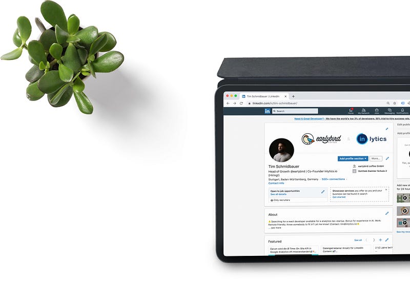
The LinkedIn experience using the native app on iPad is not great. In fact, it is not even good. The layout seems to be an export of the iPhone version. The constant need to send notifications clutter my experience of using the app and the device.
Surprisingly using their website on Safari looks and works better than their native application.
2. Medium

As a loyal Medium customer, it might seem like stabbing it in the back. Still, if I didn’t then, it would be my cognitive biases holding me from telling the observable facts regarding their application.
I believe Medium.com has been designed with desktop users in mind. It then shifted into mobile space, and then tablets; because of that, the experience of using their app on the iPad isn’t that great.
Often, the app uses the internal web-browser to load content such as your stats, and you can feel how not optimized it is for the general user.
I wish the design was more intentional to the large display of iPads — especially the 12.9" version where the viewport is significantly larger than the 10" versions. The potential of including more visual components is missed.
3. Product Hunt

I found Product Hunt four years ago when I searched for a productivity app to use on my Mac; I discovered how awesome the website is. They showcased the newest product launches and gave the developers a chance to be seen. That is a great cause to become a user of their fantastic service.
After a while, I found their iPhone app and used it for two days until I realized their website worked much better on Safari rather than a so-called native app. I got an iPad and gave the app another chance. To my disappointment, the design was so unfinished that I removed the app after one day.
I used to like their iOS app for the dark mode support, but the experience was so bad that I decided to use it through Safari.
4. Twitter
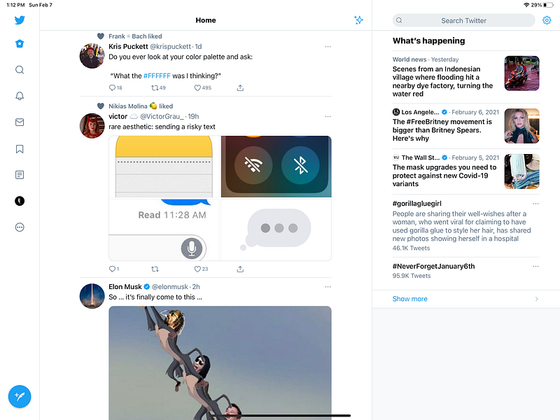
I wish Twitter made more effort in its iPad app. I wish they made as much effort for the large screen version as they do for mobile phones and Mac operating systems.
Despite many useful features like the inclusion of search to the right section of the app, it still feels like a stretched-out iPhone app. Many wasted spaces are surrounding the tweets.
Some great alternative Twitter clients exist in the App Store, which I’ll introduce in the next articles if you all are interested.
5. Unsplash
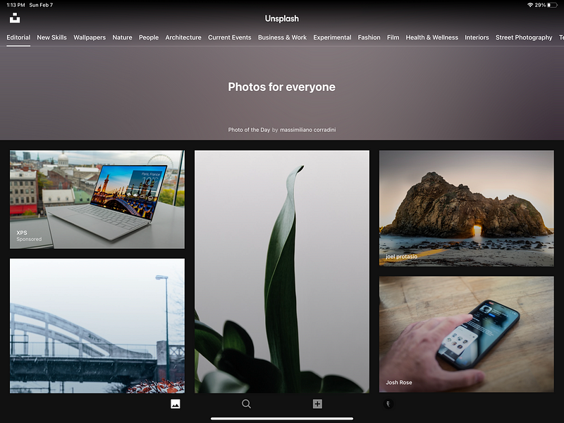
Almost every wallpaper I choose, whether for my design projects, posts in Medium, or my computer wallpaper, comes from this one of a kind service.
Unsplash has redesigned the image sharing experience and continues to do so. The design team is probably one of the best in the industry, yet when it comes to designing an iPad app, I believe they have so much to do. It starts with the lack of an iPad style visual language.
Take a look at the stock photos app on the iPad OS 14. You can see how great the design was implemented by Apple, including Sidebar navigation and many more features to make it an authentic iPad experience.
It is apparent how mobile-like the design is, starting from the bottom navigation bar to the top buttons.
Fortunately, their website works really good on Safari and gives you a better experience.
6. Google Translate
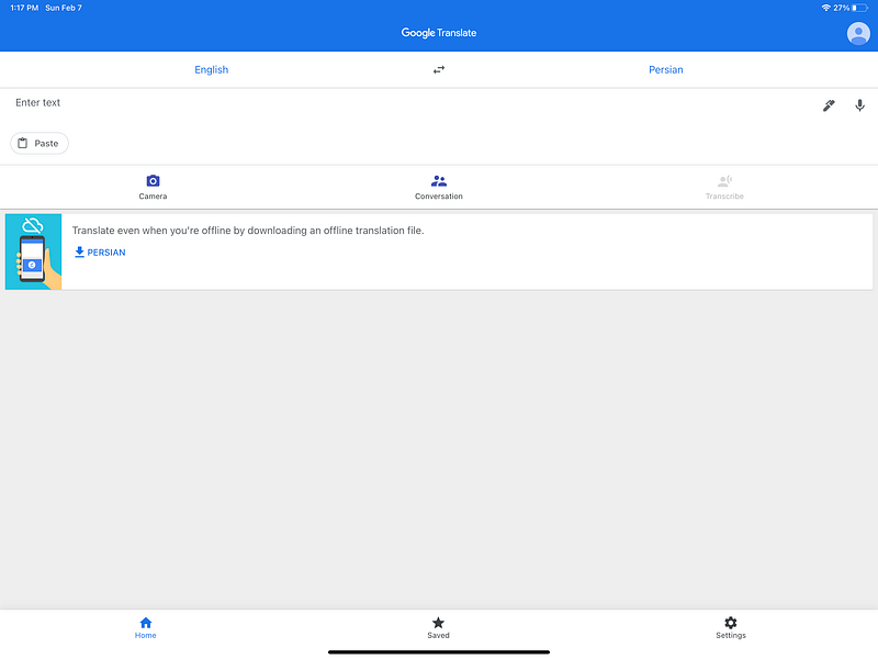
This is another Google product where the development seems to far outweigh the design.
See how stretched out the layout is, especially the lack of white-space and margins to surround the elements not giving you a sense of breathing in the design.
The app could simply dedicate two or three columns and show them simultaneously, then let the user focus on what they want to do.
The design of a translation app should be deliberate and based on many other factors like device usage, environment, culture, and people, so ethnography is an essential part of user research. I feel like Google has done a decent job here but not a good one.
Unfortunately, the website is not a pathway to a better experience. It still is a better solution, in my opinion, if you have constant access to the internet.
7. TED

TED had a redesign in the April of 2020 and introduced minimal dark elements into its visual design, moving in the right direction, in my opinion. Their mobile app is excellent, their website is also great, their iPad app? not so much.
The not-so-smooth of navigating of the user interface alongside the bottom navigation bar makes me want to stick to their website as Safari does an excellent job of showing its desktop version rather than sticking with the mobile one.
Some of the most apparent problems are observable in the first interaction with the app, such as the vast display of a TED talk image and no signifier indicating the screen’s scrollable view.
8. Amazon
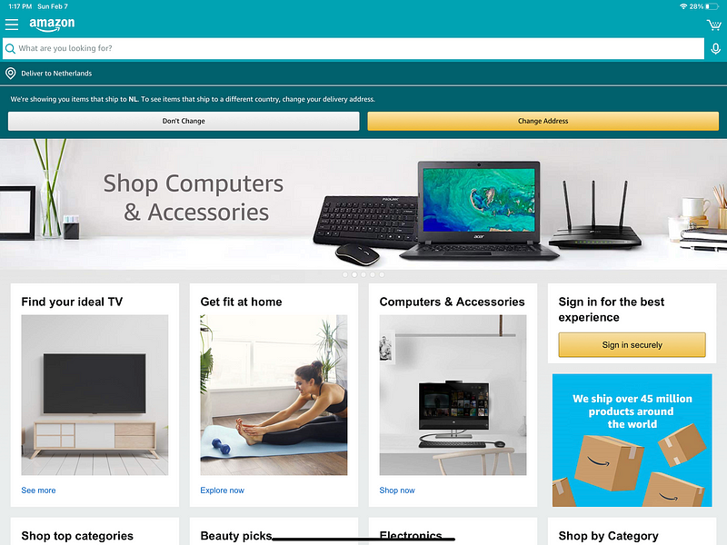
Suppose you are the type of person who gets notified about their purchase using emails and text messages. In that case, you are better off using Amazon on your Safari browser rather than using their native app.
The native app does give you notifications, but the app’s experience does not seem much better than their website.
The iPad version seems to be an identical version of their website, and I see no point in installing their app.
9. Goodreads
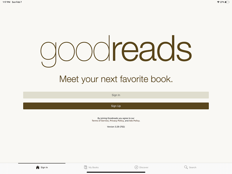
A terrific service but awful design — the whole experience is terrible, not only the iPad app (which is again awful) but also their mobile app. Their website is also poorly designed; however, I prefer the website because it is more intentionally designed for desktop users.
I hope they redesign the whole experience since GoodReads is one of those services you could rely on to find out what your friends are reading and if they recommend it.
10. Behance
Adobe has done so much in designing the first versions of Behance. Their iOS app was designed to run on almost all Apple devices (Apple Watch, iPhone, iPad, Apple TV).
Behance seems to be designed with iPad users in mind. It still needs a lot of work to be iPad friendly, especially with the latest visual changes to the iPad OS 14.
The Behance experience works not just as well but even better on Safari.
Beware that my Use-Case is different than yours.
I consider myself a “minimalist” and don’t want to get bombarded with notifications from services I don’t want.
I want my device and the apps on it to be intentional and exist based on what I truly need.
The ease of using the browser to load a service has granted me a way to become more focused on using my iPad as I genuinely want it to be used.
If you use a service such as Amazon and it is imperative to receive notifications from it, then, by all means, install the app, but for me, the notifications come as emails, and I’m ok with it.
Having a device with 128GB storage size requires being careful in managing what you own; therefore, I free up precious space to dedicate what is essential by removing unnecessary apps.
Thanks for reading this article. If there are other apps you know that have a poorly designed iPad experience, please let me know, and I will include them in my next writes.
If you enjoyed this article, give it some claps as that helps me a lot to get inspired and write more.