
10 CSS Properties Every Front-End Developer Should Know
Enhance Your Page, Simplify Your Work
In the story, I will share 10 important CSS properties with you. They are so amazing and interesting and useful.
1. :in-range and :out-of-range Pseudo-Classes
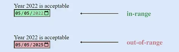
CSS’s :in-range and :out-of-range pseudo-classes are used to style inputs within and outside specified range constraints.
:in-range If the current value of an input element falls within the range defined by the min and max attributes, it is considered within range. This pseudo-class is useful for determining whether the current value of a field is acceptable.
:out-of-range If the current value of an input element exceeds the range defined by the min and max attributes, it is considered out of range. This provides users with a visual indication that the field value exceeds the allowed range.
/* Styling for elements within range */
input:in-range {
  background-color: rgba(0, 255, 0, 0.25);
}

/* Styling for elements out of range */
input:out-of-range {
  background-color: rgba(255, 0, 0, 0.25);
}
These pseudo-classes offer a straightforward way to style input elements based on their adherence to specified value constraints.
Note: These pseudo-classes apply only to elements with a scope limit, without which the element cannot be in or out of scope.
For more information, you can refer to the MDN Web Docs.
2. The grayscale Function
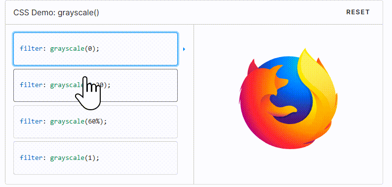
By using values ranging from 0 to 100%, you can create various effects. Lower values will retain some color, while higher values will make the image closer to black and white.
This image effect can be achieved using the CSS filter property. By setting the filter property of an image to grayscale(100%), you can completely transform the image into black and white.
To create different effects, you can experiment with different grayscale values, such as grayscale(50%), which will give the image a halftone effect.
With CSS image transformation effects, we can easily convert a color image to black and white by adjusting the values and achieving a variety of different results.
.grayscale-image{
  filter: grayscale(100%);
}
For more information, you can refer to the MDN Web Docs.
3. Glass Effect
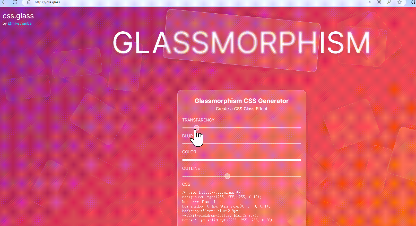
We can make a beautiful glass effect with just a few lines of code, adding elegance to our designs.
Glass.CSS is one of the most popular glass effect generators that allows us to create CSS glass effects for our projects for free. All you need to do is adjust some settings according to your requirements and then copy and paste the CSS code into your project.
.glass-effect {
   -webkit-backdrop-filter: blur(6.2px);
   backdrop-filter: blur(6.2px);
   background: rgba(255, 255, 255, 0.4);
   border-radius: 16px;
   border: 1px solid rgba(255, 255, 255, 0.24);
}
This code snippet applies a glass effect by using backdrop filters and setting the background and border properties accordingly. You can further customize it to fit your project’s needs.
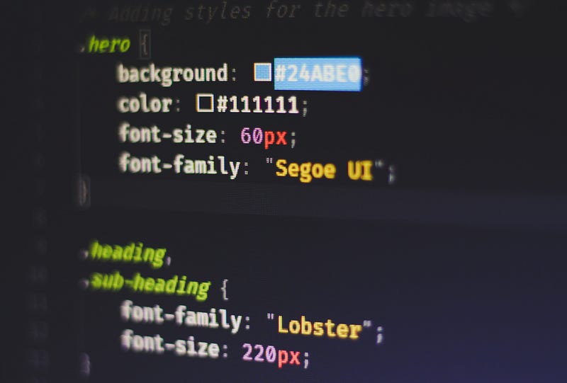
4. Styling Text with CSS
These are some very basic text styling techniques that everyone should know. However, there are many other advanced options available.
p {
font-family: Helvetica, Arial, sans-serif;
font-size: 5rem;
text-transform: capitalize;
text-shadow: 2px 2px 2px pink, 1px 1px 2px pink;
text-align: center;
font-weight: normal;
line-height: 1.6;
letter-spacing: 2px;
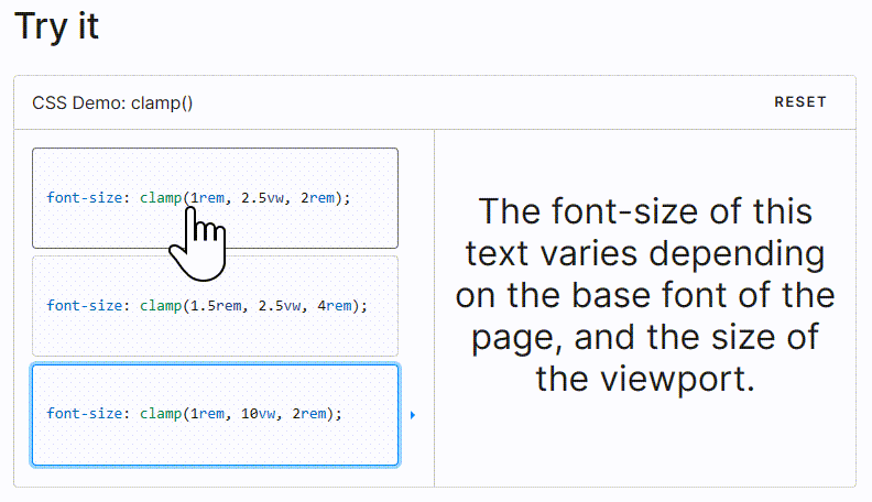
}5. clamp() Function
The CSS clamp() function restricts a value between two bounds, with a preferred value, a minimum value, and a maximum value. It comes in handy when adjusting font sizes based on the viewport.
p {
 font-size: clamp(1.8rem, 2.5vw, 2.8rem);
}
```
For more information, you can refer to the MDN Web Docs.
6. Centering a div
One of the most essential tasks for developers is centering a div. There are various options to achieve this, and in this example, we’re using CSS flexbox to center a div both horizontally and vertically.
div {
display: flex;
justify-content: center;
align-items: center;
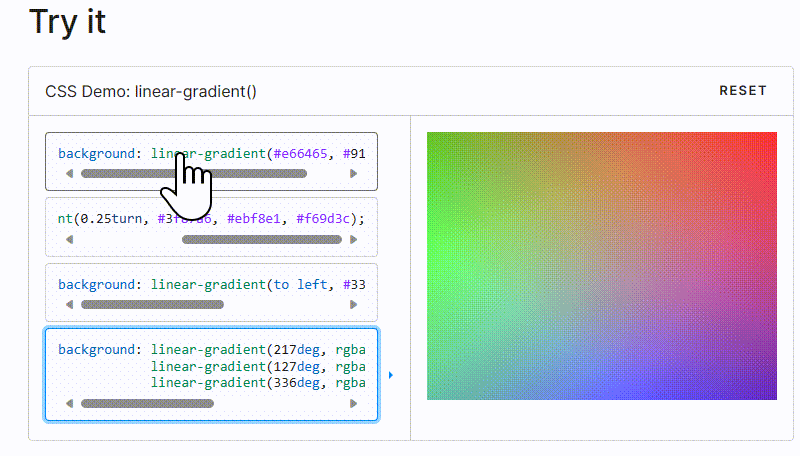
}7. CSS Linear Gradient
To create a gradient with CSS, you can simply use the following CSS code.
div {
 background: linear-gradient(35deg, #CCFFFF, #FFCCCC, rgb(204, 204, 255));
 border-radius: 20px;
 width: 70%;
 height: 400px;
 margin: 50px auto;
}
These examples demonstrate various CSS techniques for styling text, setting font sizes responsively, centering divs, and creating linear gradients.
For more information, you can refer to the MDN Web Docs.
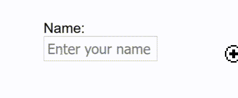
8. CSS Shake Effect
This “shake” animation effect shakes the input field when a user enters invalid content. It’s simple yet elegant. For example, if a user enters numbers instead of letters in the text field, the input field will shake.
HTML:
<input id=”name” type=”text” placeholder=”Enter your name” pattern=”[A-Za-z]*”/>CSS:
input:invalid {
 animation: shake 0.2s ease-in-out 0s 2;
 box-shadow: 0 0 0.4em red;
}

@keyframes shake {
 0% { margin-left: 0rem; }
 25% { margin-left: 0.5rem; }
 75% { margin-left: -0.5rem; }
 100% { margin-left: 0rem; }
}
This code creates a “shake” animation for input elements with invalid content. It uses the pattern attribute in the HTML input element to specify the valid input pattern.
When invalid input is detected, the input field shakes briefly, providing a visual indication to the user.
For more information, you can refer to the MDN Web Docs.
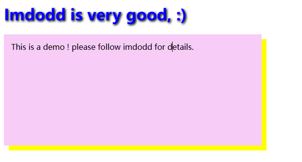
9. Shadow Effects
With CSS, we can add effects to text and elements using the properties text-shadow and box-shadow.
- text-shadow: This property adds a shadow to text.
Example:
h1 {
 color: blue;
 text-shadow: 2px 2px 4px #000000;
}
`box-shadow` is used to add shadow effects to elements. In the example below, the actual `div` element is purple, and the box shadow is sky blue, offset 10 pixels to the right and 10 pixels down.
div {
 width: 200px;
 height: 200px;
 padding: 15px;
 background-color: purple;
 box-shadow: 10px 10px sky
}
10. Hue Rotation Animation
You can use the following CSS code to create a hue-rotate animation:css
.button {
   background: linear-gradient(35deg, #8C52FF, #C669FF);
   animation: hueRotate 3s linear infinite alternate;
}

@keyframes hueRotate {
 to {
   filter: hue-rotate(85deg);
 }
}
In this code:
- We’re targeting an element with the class “button” for the animation.
- We apply a linear gradient background to the button, which creates a gradient between two colors (#8C52FF and #C669FF) at a 35-degree angle.
- The animation is defined using the `@keyframes` rule with the name “hueRotate.”
- Inside the keyframes animation, we use the `filter` property to apply the `hue-rotate` filter to the element. This filter rotates the hue of the colors by 85 degrees.
- The animation lasts for 3 seconds, has a linear timing function, runs infinitely, and alternates between the original hue and the rotated hue.
This code will create a color-shifting effect on the button, giving it a dynamic and eye-catching appearance.
Welcome to follow Imdodd, I will continue to write a lot of interesting games and JavaScript, and Vue.js learning experience.
In addition, I wrote an article on how to optimize code performance. If you are interested, you can also take a look.
In Plain English
Thank you for being a part of our community! Before you go:
- Be sure to clap and follow the writer! 👏
- You can find even more content at PlainEnglish.io 🚀
- Sign up for our free weekly newsletter. 🗞️
- Follow us on Twitter(X), LinkedIn, YouTube, and Discord.


